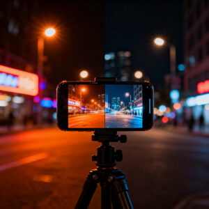
How your phone boosts night photos
Your phone uses tricks you can feel in every shot. It stacks multiple frames to boost light, keeps ISO in check, and moves brightness where your eye would—so you aren’t stuck with a muddy dark picture. You get brighter scenes without blowing out the highlights, and you see more color than you’d expect from a single snapshot. This adds up to photos that look more like what you remember, not what a dim street really looked like.
You’ll notice the camera makes smart choices in real time. It picks a fast enough shutter to avoid blur and then nudges exposure to bring out the glow from street lamps or a reading light. The result is images that feel natural, not flat, even when the scene is tricky. It’s like having a mini editor in your pocket that knows when to brighten, when to hold back, and how to keep skin tones from turning gray.
If you want a night shot that tells the story, you can try a few simple tweaks. Tap to focus on a bright spot, hold still for a second, and let the camera do its math. The phone will blend texture from the shadows with the glare of lights, so your photo can feel alive rather than flat. The power is in the way the phone combines parts of several frames into one final look.
HDR and computational photography on phones
Your phone uses HDR to blend several images into one. You get brighter shadows and preserved highlights without extra blur by stacking exposures. This makes night scenes pop with detail you’d miss from a single shot. Computational photography adds color, contrast, and texture in smart ways, adjusting color channels so neon reds stay vivid and blues remain calm. The result is a cleaner, clearer photo you can share right away.
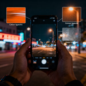
There’s a small caveat. If you zoom in on a night photo, you might notice ice-like noise in flat areas or a faint halo around bright lights. That’s the cost of stitching multiple frames. You can reduce it by using a steadier stance or enabling a night-specific mode that moderates the stacking.
Image processing noise reduction and sharpening
Noise reduction smooths the grain in dark shots while preserving detail in textures like bricks or tree bark. Sharpening then brings back edges so words and signs stay legible. It’s a careful balance: too much smoothing can look plasticky; too little sharpening can keep the noise. Your phone tries to stay crisp without turning noise into clutter.
In practice, this makes night photos feel cleaner and more present. A quick check after a shot lets you tweak contrast or exposure if needed, but the default balance often hits the sweet spot.
Why this looks different on a monitor
The same photo can look different on a computer screen. Your phone’s display boosts color and brightness in real time, while a monitor aims for a more neutral view. Phone processing emphasizes pop and contrast for small screens, which can feel off on larger displays. If you’re sharing, note that the photo was processed for a phone screen to set expectations.
Always check your photo on a couple of devices before judging. If it’s too bright on your phone, try lowering exposure a notch or switching to a standard mode to see how the scene reads on a bigger screen.
Phones vs computer photo color rendering
When you snap at night, your phone and your computer don’t show colors in the same way. Your phone screen is bright and warm, tuned for vivid selfies, while a monitor aims for neutrality. This mismatch can make a photo feel exciting on your phone but flat on a computer. Expect phones to boost blues and blacks; computers tend toward a flatter, more true-to-life palette.
Colors shift after transfer because each device handles color data differently. Your camera captures light; your phone’s color processing adds warmth or punch, and computer software may present a more restrained result. This is why a photo can look great on your phone but off on a monitor. Color rendering isn’t wrong on either device—it’s shaped by each display’s rules.
To get consistent results, test a few photos on both screens. Shoot a simple scene at night, then compare: note which colors read brighter, which parts look duller, and how skin tones feel. The goal is predictable color so your photo reads well wherever it’s seen.
Display calibration differences phone vs monitor
Phone screens are calibrated for quick, in-hand viewing, often with higher brightness and warmer tones. Monitors aim for neutral balance. This means a photo may look punchier on your phone and more washed out on a monitor. Calibration also affects white balance: a warm phone may show blues as teal on a cooler monitor.
When editing or selecting night photos, aim for balance that looks right on both screens. If possible, view on several devices before finalizing.
Gamma curve differences between displays
Gamma curves map black to white differently on each device. Phones push more detail into shadows, which can make an image read deeper on a phone than on a monitor. If you edit for one device alone, you might lose shadow detail on another. Test with scenes that have bright highlights and dark areas to tune exposure and contrast for cross-device harmony.
How contrast and peak brightness change perception
Contrast and peak brightness shape how you perceive night shots. High contrast can make lights pop on a phone but clip details on a monitor. Bright screens exaggerate glow; dimmer displays keep glow in check. Test the image at different brightness levels to achieve a balance that looks real across devices.
Color gamut: sRGB vs DCI-P3 on devices
You’ll hear about two big color spaces: sRGB and DCI-P3. sRGB is the standard space for most phones and apps, offering predictable, share-friendly colors. DCI-P3 is wider and can make greens and reds deeper, which can make neon signs pop on some screens. If you save in sRGB, a DCI-P3 screen won’t magically show colors that aren’t there. The camera, file, and display together determine the final look, so your device choice matters for how vivid or true-to-life colors appear.
Generally, for universal sharing, keep the file in sRGB. If you’re targeting a wide-gamut audience on capable devices, you might enjoy the richer look of DCI-P3. The aim is consistency across where your photo will be seen, not just on your own phone.
In practice, some screens render saturated nights with greener greens and deeper reds; others push toward pinks or oranges. When editing, try matching to sRGB for universal sharing, and switch to DCI-P3 only if you know the destination device supports it. This helps you predict how your night photos will look on different screens.
Mobile display color science
Your phone’s display is a tiny color lab. Each RGB channel is tuned to produce the image you see, with some devices skewing warmer for comfort and others cooler for a crisp night vibe. The phone sensor also decides tone and color, and the display remaps those colors for your eye. A photo can look different across devices because of this tuning.
Color science also governs processing tweaks you’ll notice when you tap scenes: white balance adjustments to keep lamps from looking odd, subtle shadow boosts to reveal silhouettes, and tone mapping to prevent blown skies. For true-to-life results, seek a device with accurate white balance and predictable tone mapping. For a stylized look, some devices push contrast and color slightly beyond real life.
In short: mobile display color science explains why a single photo can feel lively on one screen and muted on another. Understanding this lets you shoot with intent—realistic or with a personal night-glow vibe.
How gamut affects saturated night lights
Gamut is a color playground. Saturated night lights—neon signs, traffic lights, shop windows—benefit from a wider gamut only if the source isn’t clipped. Wide gamuts can intensify reds or blues, but they won’t rescue overexposed colors. With sRGB, you get safer, predictable saturation; with DCI-P3, you gain potential punch on capable displays. The key is consistent workflow: shoot in a known space (often sRGB) and edit with a target in mind.
Practice shows differences in saturated scenes across devices. Some screens render greener greens and deeper reds; others skew differently. Edit with a color-managed workflow, aiming for sRGB for universal sharing, and reserve wider gamuts for compatible destinations. The goal is dramatic yet believable color across screens.
Why colors shift between devices
Colors shift because of different displays, color spaces, and processing paths. One device may render a neon sign warmer or cooler than another. The same photo can look bold on one screen and muted on another due to how each device interprets color. Gamut, brightness, and tone mapping all influence this.
What to do? Shoot in a standard space like sRGB for broad sharing. If you know your audience, you can craft a version for wider gamuts to maximize impact where it matters. The key is testing: view on multiple devices and adjust white balance, contrast, and saturation for consistency.
Auto white balance and night photography
When you point your phone at a dark scene, the camera estimates the scene’s light and sets white balance so whites look white and colors stay believable. Auto White Balance (AWB) weighs many tiny clues and can keep skin tones warm or cool depending on the strongest light in frame. The goal is consistency across frames, even as light changes as you move.
AWB is fast and convenient, but it can be fooled by unusual lighting like neon signs. If you want true color vibes, rely on AWB for quick shots and adjust later in editing or lock white balance in stable lighting.
How auto white balance favors your phone
AWB keeps colors pleasant in fast moments, helping skin tones stay natural and preventing casts from skewing the scene. It’s great for candid shots, but it can overcorrect when a bright colored sign or lamp dominates the frame. If you want a specific mood, switch to manual white balance or adjust later in editing. AWB is a helpful friend for getting the shot quickly, not a final color bible.
Why monitors show the raw white balance
Monitors display the raw white balance so you can see the camera’s capture, not the eye’s expectation. This helps you decide how to fix color casts in post. Colors can look warmer on a phone and cooler on a monitor, which is normal because screens have different color science. Knowing the raw balance lets you correct for cross-device viewing.
Tips to match white across screens
- Shoot with a neutral gray card to anchor white balance.
- Use white balance lock in stable lighting.
- Edit with consistent color profiles, then preview on multiple devices.
- Favor natural tones over dramatic shifts when viewing on different lights.
How to handle color science and night photos
Why Night Photos Look Good on Your Phone Screen But Bad on a Computer (Color Science Explained)
Your phone’s color science is tuned for quick, pleasing results on its own screen. When you move to a computer, the difference in display tech can shift how night colors read. Each device interprets red, green, and blue a bit differently, and night lighting adds complexity. The phone’s warmth and punch may not translate to a monitor. Use this knowledge to leave room for adjustments in post or shoot with a neutral target in the frame.
Ambient light and metamerism in displays
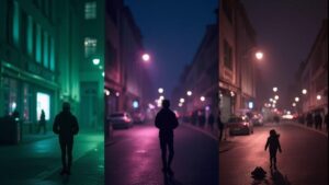
Metamerism happens when colors look different under different light sources because screens and eyes don’t share the same lighting. Colors can shift under a lamp, streetlight, or blue screen, and your display tries to map colors with its own primaries. Ambient light can cause parts of a night photo to look off when viewed later.
Metamerism is a mix of lighting, display tech, and color processing. When you shoot, your camera captures a balance of red, green, and blue; your phone displays it with its primaries. If lighting changes or the display primaries don’t match the scene, what you see differs from reality. Think of metamerism as a color translation glitch between capturing and viewing.
How room light alters what you see
Room light acts like a color filter. Warm lamps push tones toward orange and red; bright cool lights push blue. Review night photos under different room lights to see how shifts affect color balance. Auto white balance can misread mixed lighting, so you may want to lock WB or shoot RAW to adjust later.
Your eye can notice shifts more than you think. The phone can rely on sensors and software to balance colors, but it might still show a different balance than you see in the room. This knowledge helps you judge what you’re seeing when you review the shot.
Metamerism with different display primaries
Different brands use different display primaries, so a photo can look vivid on one device and off on another. When comparing devices, you’re often seeing metamerism at work. To minimize surprises, compose, shoot, and review on the same device, or compare under the same lighting.
Simple checks to spot metamerism
- Compare on the same screen you shot with.
- Check under different room lights for color shifts.
- Look at skin tones; shifts can signal metamerism.
- Use a neutral gray card as a reference.
Why Night Photos Look Good on Your Phone Screen But Bad on a Computer (Color Science Explained)
You’ve taken a night photo with your phone and notice it looks better on your screen than on a computer. The gap comes from color science and display brightness. On a phone, the image often looks vibrant and balanced, but a monitor can shift colors and flatten contrast. Phones tune colors for small, bright screens, while computers show a more neutral version.
The way light is captured is the same, but screens differ in color rendering. Phone screens are bright and punchy; older monitors can look cooler or flatter. If you shoot in the dark, cameras boost reds and yellows; computers may mute those boosts. This mismatch explains why night photos feel different across devices.
When you compare, you’re looking at color, brightness, and gamma curves. A phone boosts brightness and contrast to keep night images lively; a PC screen can appear darker and more muted, revealing color casts from white balance. The result is a photo that seems colorful on your phone but washed out on a computer. Choosing a color profile and adjusting brightness can help keep your night photos looking consistent across devices.
Why night photos look better on phone
A phone’s screen is small and punchy, exaggerating color and contrast to make night shots pop. Automatic processing boosts saturation and warmth, so the image reads as rich. The screen’s brightness and local dimming make highlights like stars and streetlights shine. This combination creates a memorable, engaging night photo on a handheld display.
The color management on mobile devices aims for a pleasant in-hand look, often leaning warm and saturated to feel natural in mixed lighting. That makes the image feel more appealing in your hand, even if it isn’t a perfect digital copy of reality.
Phones vs computer photo color rendering (revisited)
Phone rendering is geared toward quick, appealing viewing; computers tend to show truer or cooler colors with less saturation. If you edit on a computer after viewing on your phone, you’ll notice the mismatch. Align color profiles and adjust white balance for consistency, and consider matching brightness and contrast as well.
Practical steps to fix mismatched night photos include shooting RAW if possible, using a neutral white balance, and previewing edits on multiple devices to bring colors into harmony. A consistent workflow—RAW, neutral WB, calibrated display, and standard color profile like sRGB—reduces big surprises when others view your night photos.
Practical steps to fix mismatched night photos
- Shoot with a neutral profile and RAW if possible.
- Balance white point to a neutral gray and check skin tones.
- Monitor histograms to avoid clipping highlights and crushed shadows.
- Calibrate your monitor or use soft proofing for reliable edits.
- Compare edits on phone and PC and adjust for cross-device consistency.
- Export in a standard color profile like sRGB for universal sharing.

Smartphone Night Photography Enthusiast & Founder of IncrivelX
Vinicius Sanches is a passionate smartphone photographer who has spent years proving that you don’t need an expensive camera to capture breathtaking images after dark. Born with a natural curiosity for technology and a deep love for visual storytelling, Vinicius discovered his passion for night photography almost by accident — one evening, standing on a city street, phone in hand, completely mesmerized by the way artificial lights danced across wet pavement.
That moment changed everything.
What started as a personal obsession quickly became a mission. Vinicius realized that millions of people were carrying powerful cameras in their pockets every single day, yet had no idea how to unlock their true potential after the sun went down. Blurry shots, grainy images, and washed-out colors were robbing everyday people of memories and moments that deserved to be captured beautifully.
So he decided to do something about it.
With years of hands-on experience shooting city streets, starry skies, neon-lit alleyways, and creative night portraits — all with nothing but a smartphone — Vinicius built IncrivelX as the resource he wished had existed when he was just starting out. A place with no confusing jargon, no assumptions, and no gatekeeping. Just honest, practical, beginner-friendly guidance that actually gets results.
Vinicius has tested dozens of smartphones from every major brand, explored dark sky locations across multiple states, and spent countless nights experimenting with settings, compositions, and editing techniques so that his readers don’t have to start from scratch. Every article on IncrivelX comes from real experience, real mistakes, and real lessons learned in the field.
When he’s not out shooting at midnight or writing in-depth guides for the IncrivelX community, Vinicius can be found exploring new cities with his phone always within reach, looking for the perfect shot hiding in the shadows.
His philosophy is simple: the best camera is the one you already have — you just need to learn how to use it in the dark.